12th Man Foundation
Project ― Visual & Interaction Design
The 12th Man Foundation strives to continue Texas A&M's athletic success by funding scholarships, programs and facilities in support of championship athletics. Every year, thousands of fervently loyal former Texas A&M Aggies renew their season tickets for the University’s largest sports programs facilitated through the 12th Man Foundation’s website and through call centers.
In an effort to increase renewals/purchases and decrease customer service calls received regarding the subject, the 12th Man Foundation sought the help of myself and my fellow colleagues at Jackrabbit Mobile to streamline their antiquated legacy system.
1. My Role
I collaborated with a team of Designers at Jackrabbit to build the complete web and mobile experience for the 12th Man Foundation. I came into the project after it had been started, as such I provided a support role during most of the Research phase. My primary responsibilities included the Visual & Interaction Design of Seasonal Ticket renewals and the Admin Panel used by the 12th Man Administration team.
2. Understanding the Challenge
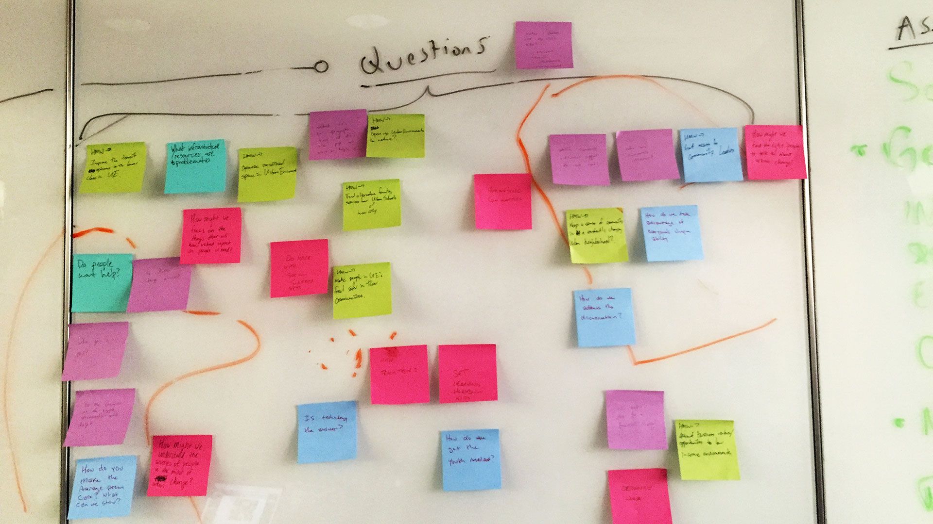
The project started with an extended research phase to gain insights into the 12th Man Foundation user base; consisting of several series of User Interviews, Validation Sessions, and various mapping methodologies.
During the research phase, our team gathered invaluable insights that became crucial to the success of the project. A simple yet powerful insight gained during this period, which ultimately proved to be a guiding motif for the project as a whole, was that Aggies were loyal to a tee.
We found that most users wove their families’ traditions and Aggie traditions in to each other. These alumni saw themselves as “the first people to get to the tailgate” and attended as many sporting events as possible, often as an entire family. They were keen to joke that they “bleed maroon,” and that they liberally donated to the university athletics department.
While these users were extremely loyal to the University and its athletics programs, Aggies fans complained loudly ― and often ― about the difficulty and confusion they faced during the season ticket renewal process.
3. Designing for Delight
In order to give our target users the clarity and speed that they were requesting, we redesigned the entire experience so the user can feel more confident about the transaction and their donations.
Focusing on the critical user paths during ticket renewals, I conducted series of rapid prototypes/wireframes, validating each round with lean user testing sessions afterwards. We used these testing session to gain insight into where users faced the most ambiguity and confusion in the process.
The last task of the project was to design and establish the visual system to reflect the values of ease of use, efficiency, and consistency.
- Want to see more? Have questions?
- Lets chat!


